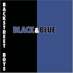
What You See Is What You Get: Backstreet Boys - Black and Blue

If there's any proof needed as to why prefab corporate pop music sucks, here it is in all of its drab and soulless splendor. I used to wonder why Mark Rothko's modern color faceoffs were always held in high regard in the art world. He's Michaelangelo compared to this boring, precise color presentation that's indicative of the rushed, cardboard standup product of its performers. I understand Rothko now and I appreciate the relationship of colors he was trying to convey, even when they grossly contrasted each other. At least that has more heart and mental input than this garbage. I wonder what hack got commissioned to do this cover. Buy him or her a beer; that's the greatest scam ever pulled.
Thank God the boy band era has seen fit to go back into the obscure hilarity from which Menudo and New Kids on the Block dwell like the pre-packaged paper dolls they were, sitting in some former little girl's attic, not to be unearthed for years. Thank God there's some things you can outgrow.
Now the real bitch I have about this album is that I've picked up it many times and always forget it's not the hard rock band Black 'n Blue, but I fall sucker for it a lot. If any of you see me bring it to the register, please have me committed on the spot.

5 Comments:
Yeah, but you shouldn't be picking up Black n Blue album any more than you should a Backstreet Boys one. I agree with you that the cover is every bit as soulless as the music.
I don't agree with Bob about the Black -n- Blue album. However this cover is lame. I am almost surprised how plain it is. You would think something trendy would be more glitzy. Maybe they don't think much of their fan's intelligence and think the cover should just be plain colors with big words. Like a stop sign only this one means "Buy this and you will be cool or at least until the band stops being popular".
You would think that a big industry band like this would have a serious cover. This looks like some guy did this on his home computer in ten minutes.
-- david
I'm a big fan of simple designs, but the key to simplicity is subtlety. This is about as subtle as my ass after a couple of 7 layer burritos from Taco Bell.
Quote of the day goes to Chuck! Grand Instigator Award goes to Bob!
I believe that most of the other BB albums were group shot album covers, which is no more inspired than this crap, but I agree for those who DO like them (woe be unto them) for issuing such obvious trash inside and out. If there's a better example of "pre-packaged corporate music," I'm not interested.
Post a Comment
Subscribe to Post Comments [Atom]
<< Home