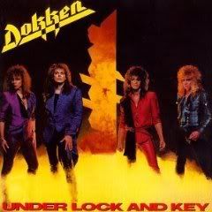
Dokken-Under lock and key

In 1984 Dokken's "Tooth and Nail" hit and achieved a fair amount of success. So the band were back in the studio and quickly knocked out a follow-up to try and catch in on their new found success. For this their third release they decided to stick themselves on the cover. The first thing that strikes me about this cover are the outfits. They just don't look ridiculous even by 1985 standards. Someone seemed to think it was very important for each member to have their own designated color like they are pieces in some tacky, hair metal board game. Next we have a large, vertical key shape smack dab in the middle of the cover. Then if you look closely you see that the key shape is actually shaped like the Dokken logo. Yet the Dokken logo is already in the upper left hand side in bright yellow for all to see. So did it need to be there again? I guess it was the idea of someone who really thought the band just needed a push no matter how silly it looked. Or perhaps it's there just to seperate George and Don so they would not strangle each other. The band are also standing in what appears to be urine colored smoke. After all this attention to the above images at the last minute someone probably slapped their head and said "doh, we forgot about the album title!". So it was quickly smacked in at the bottom in bold, but generic letters in bright red. The overall effect is one of pure cheese. I also get the impression that whoever did the cover was trying to sell the band as much as they were trying to sell the album and that approach doesn't sit well with me. However, once you get past the cover it's a decent album musically.

4 Comments:
That's a good breakdown, I'd say. Urine-colored smoke, oy... Naturally in the eighties they were more interested in pushing the bands than anything else, albeit Ratt did strike sex gold with the first three covers (including the EP) before putting themselves on Dancing Undercover... I would say by measures of good taste, a band (versus individual performer) should 9 times out of 10 be relegated to the back cover, although certain bands can get away with it like The Who, Deep Purple or Steppenwolf
I don't think it's a matter of some bands being able to get away with being on the cover and others not being able to do the same. It's more a matter of whether their presence is part of something more artistic than just a group shot. Look at Meet the Beatles or My Generation. Both are group shots that became iconic, because there's more artistic substance (and less urine colored smoke).
Right on, the Beatles are another excellent example. Unfortunately the eighties didn't really produce too many iconic band images on the front cover, U2 notwithstanding, maybe Duran Duran, albeit the latter looks more dated than U2
I think there were a lot of generic group shots on 80's covers. I agree with Bob that much of it relies on whether the band has a presence or not. A number of 80's group shot covers were more about the band showing off their soon to be dated outfits than anything else. Motorhead's "Ace of spades" is an 80's group shot that works. It's slightly goofy yet somehow cool and that's very much a part of that band's appeal. One of my least favorite group covers of the decade is the $5.98 EP. It's Metallica posing and caring about a look. To me that marked a big change in their attitude. At least they were not wearing that outfit that Don Dokken has on though.
Post a Comment
Subscribe to Post Comments [Atom]
<< Home