Sunday, January 25, 2009

KISS and Manowar

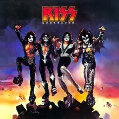
Here is KISS-Destroyer from 1976.

Photobucket


Here is Manowar-Fighting the world from 1987.

Photobucket

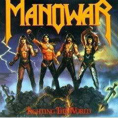
Both were done by fantasy artist Ken Kelly. So my question is was the Manowar cover done just because they wanted to be like KISS or was Kelly running out of ideas so he "borrowed" from his previous work? I have no idea. Maybe it doesn't matter. Both have a high cheese content, but the KISS cover works better for me. To me their cover says "we are goofy and over the top, but we know it". While Manowar's cover seems to be saying "we are very manly men even though we have long hair, shaved chests and custom made leather outfits". I guess it's all in the eye of the beholder though.

Labels: , ,

Wednesday, January 21, 2009

U2 - Achtung Baby


For the album that would redefine them as a band, U2 got first-rate photographer Anton Corbijn to work on the cover and he took some truly fantastic shots. However, the design work (courtesy of Steve Averill and Shaughn McGrath) fails to come up with something as iconic as the music or as some of their past covers. Instead, the cover is largely remembered for the nude picture of bassist Adam Clayton that appeared on back of the LP cover, but didn't make it onto the CD art.

Friday, January 16, 2009

INXS, Listen Like Thieves

Something about this cover impresses me.

I think it’s the fact that the Australian band’s name really is the cover. The letters provide a window to the image behind; as best I can figure out—through the angles of I, N, X, and S—that’s a scrawny Michael Hutchence about to belt out “What You Need,” the hit single from this album. The image is just bright enough, and just unclear enough, to keep us uncertain what we’re looking at.

But something else about the cover really annoys me.

If the band’s name is the cover itself, why bother putting the band’s name again in the upper right-hand corner?

Monday, January 12, 2009

The Aqua Velvets-s/t

Photobucket
The Aqua Velvets were part of the 1990's surf revival. The cover of their self-titled debut is simple yet it manages to be humorous without being over the top. So many surf covers of the 1960's show wave after endless wave, but sticking the toy surfer in the water was a great idea. The colors and band logo are effective as well.

Labels: , ,

Monday, January 5, 2009

Sepultura - A-Lex


Still yet-to-be-released this year, the new Sepultura album A-Lex (which is a very fine effort, for the record) is based on the novel A Clockwork Orange moreso than the actual film by Stanley Kubrick.

What's particularly grabbing about A-Lex is this complex design probably done through steel and copper tinted graphics that looks fairly like a real deal sculpture. In some ways it's like an Heironymous Bosch painting reinterpreted through a different medium and the project madness that haunts Alex in A Clockwork Orange is well-designed here. The face at the bottom is insinuated to be Alex himself with the plethora of ultraviolence springing madcap proverbially overtop his head.

The debauchery and rape depicted in both the book and the movie is graphically twisted and contorted on this cover, making for one hell of a disturbing image, real horrorshow like...

Labels: