Wednesday, May 27, 2009

Creedence Clearwater Revival - Willy and the Poor Boys


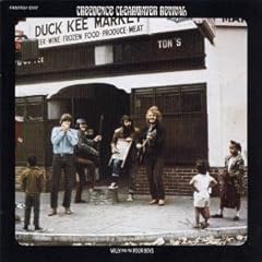
I had to flip a coin between CCR's Green River and Willy and the Poor Boys since both albums are crucial slabs of American rock 'n roll. On a visceral level, I love the aesthetic of John Fogerty and the boys hanging in the shadowy woods on Green River, however, Willy and the Poor Boys really makes a statement here with its smashing down of racial barriers by mere image.

The statement says music is our common ground as human beings and with CCR visually throwing down in a weathered section of town with the fortification of producing two of their biggest hits "Down On the Corner" and "Fortunate Son," the message plastered upon the cover to Willy and the Poor Boys becomes far from subtle by attrition. Brave and utterly appealing from a humanistic standpoint.

Labels:

Sunday, May 17, 2009

Opiate for the masses-Manifesto

Photobucket

Industrial band Opiate for the masses chose a slightly retro, military-tinged cover for "Manifesto". I like the simple images, the tones and even the style of the band logo and album title. Nothing new perhaps, but I look at it every time I pick up so they must have done something right.

Labels: ,

Tuesday, May 12, 2009

Boris Grebenshikov, Radio Silence


Once in a while a new musical artist draws your attention simply because someone tells you he sounds like another one you like.

The first instance of this I can remember was in 1989, when I heard or read that Russian singer/songwriter Boris Grebenshikov echoed Peter Gabriel, who had emerged as one of my favorites. So I bought this album, which was produced by Dave Stewart of Eurythmics fame and which gave Grebenshikov his first big Western opportunity.

He failed to do much with it; the album sold poorly and despite positive reviews, is largely forgotten now. The cover, however, has two features that caught my attention then and have stuck with me.

First, I hadn’t seen much Cyrillic script then, so the artist’s initials in Russian at the upper right fascinated me.

Second, look closely at the rendering of Grebenshikov’s eyes. Diamonds may be forever, but are they really appropriate for your pupils?

Monday, May 4, 2009

Damien-Stop this war

Photobucket

The sophomore effort from Ohio's Damien has a cover that I always take time to look at. It's not expertly drawn and the concept is a little confusing, but there is something about it that interests me. Likely it's because I always wonder why the planes are dropping albums? It was 1989 so it was getting towards the end of vinyl's first big run. I don't know if the dropping of albums was a statement on formats or not. Or perhaps this was a marketing idea and that Damien were hoping to release their album by planes so that people would have to get see them whether they wanted one or not. Or perhaps it's just an okay album cover.

Labels: ,