Saturday, June 30, 2007

NOFX - Surfer 7"


Punk rock funny-guys NOFX chose to lampoon the cover of punk rock not-so-funny guys Bad Religion's classic album, Suffer. They really nail it too, right down to the way they represent NOFX on the kid's wetsuit. Apparently, more thought went into the cover than the music about which they state, "I didn't take more than 10 minutes to write any of these songs." Of course with 14 songs on this 7", that adds up to over two hours of songwriting.

Labels: ,

Friday, June 29, 2007

Didjits - Lovesicle 7"


This is kind of along the lines of Soul Asylum's parody of Herb Alpert. The Didjits get a greasy, pasty guy (it might be a band member, but I'm not sure) to pose as Prince for their take on Lovesexy. Somehow, I think it's appropriate that they took sexy out of the title.

Despite the lack of interest in what I thought was the very funny Poopiehead 7", I'm going to be posting a few of the interesting 7" covers from my collection, so keep an eye out for these bonus posts outside of the normal Monday through Thursday rotation.

Labels: , ,

Thursday, June 28, 2007

George Michael - Listen Without Prejudice Vol I


A dramatically cropped version of Weegee's "Crowd at Coney Island" (original photo) is a complete contrast to the murder photo that graces the cover of John Zorn's Naked City. Everything that identified the location as Coney Island was removed, leaving an almost abstract mass of happy people celebrating in the summertime. There were many possible interpretations as to how the album title and photo fit together. When I finally managed to put aside my disgust for George Michael and listen to the album without any prejudice, I was amazed by the richness and depth it contained.

Labels: ,

Wednesday, June 27, 2007

Executioner - In the Name of Metal/Break the Silence


For both of their album covers, Executioner chose heavy metal artist extraordinaire, Michael MacKenzie. Unfortunately, it appears that MacKenzie must've been in middle school when he painted the cover for 1986's In the Name of Metal.


What a difference a year makes though. The following year it appears he may have enrolled in a high school art class in order to create the meticulous yet subtle masterpiece that appears on Break the Silence.

Seriously though, Executioner may have been the best of the forgotten speed metal bands. I really have to wonder if they might have done better had they hired a real artist to do their album art, because I've seen better stuff submitted by the readers of my kids' Highlights magazine. I guess that wasn't their only problem though. They were on that heavy metal black hole of a record label, New Renaissance.

Labels:

Monday, June 25, 2007

Nekromantix - Dead Girls Don't Cry


This amusing homage to the original silent film version of Nosferatu (in my opinion the greatest vampire flick of all-time), done by those flat-topped Danish dudes of Nekromantix is a highlight for them, since most of their covers feature their heads making silly, apish faces, like this one, for example, that says "Jesus, man, who had Cajun catfish for dinner?" :


Such chicanery is part of Nekromantix's schtick along with being one of the best psychobilly bands on the planet, but getting back to Dead Girls Don't Cry, that cover is both comical and stylish. I think the shadowy flat-tops allows Nekromantix to get away with the Nosferatu tweak, making it fun instead of genuinely creepy. Buzzcut vampires that play slap basses shaped like coffins? Dig it...

Poopiehead 7"

Since Metal Mark posted on Saturday, I figured that left Monday open for a fun bonus post:

This little EP is bold enough to ask the question we've all wanted to ask, but didn't have the guts. Not only does it ask, but it also has the answer.

This indie pop 7" was released in 1996, but I actually got it about five years ago when I ordered some stuff from Texas-based Peek-a-Boo Records. Their site has some info about if for anyone who's interested, but you'll have to check Ebay if you want a copy, because it's out of print. The only thing really notable about Poopiehead (other than the obvious philosophical question they have answered for us) is that their studio drummer was Spoon's Jim Eno.

Labels:

Saturday, June 23, 2007

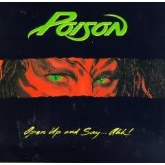
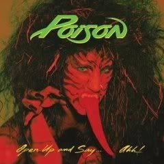
Poison-Open up and say...ahh!

This was Poison's sophomore effort and it was released in 1988. However the original covers was quickly banned and here is the second cover.
Photo Sharing and Video Hosting at Photobucket

So what was so awful that black strips had to be added? Well, let's see....

Photo Sharing and Video Hosting at Photobucket
Oh, it's a great big, stupid red tongue that looks as if it were made out of red play dough. This cover was pure cheese even by 1988 standards. In 2006 this album was remastered and re-released with a bonus track and the original cover so that you can see it in all it's glory.

Thursday, June 21, 2007

John Zorn - Naked City


New York photographer Weegee's "Murder Victim" from 1940 is a shocking image. The victim's blood shines on the pavement, his face melds with the concrete, and his fashionable appearance sharply contrasts with his gruesome death. A gun lies just out of the victim's reach; perhaps it's the murder weapon or maybe it's the dead man's pistol. This is the city, in all of its naked glory. John Zorn borrowed the title of Weegee's 1945 book for this album. Like the photo, the music is difficult and beautiful at the same time.

(Next week: Another album cover successfully uses a famous Weegee photo with a completely different mood.)

Labels: ,

Wednesday, June 20, 2007

Ded Engine - s/t


Considering what must have been an incredibly low budget and a band name that can only be described as moronic, I suppose the cover of Ded Engine's self-titled album isn't that bad. On second thought, yes it is. You'd think an old engine block with sparklers inside would be the worst thing on the cover, but it pales beside that logo that was likely designed by a sixth-grader. Check out the back cover to see the "I wanna be scary" dorks in the band before listening and the music will actually be a pleasant surprise. (I just hope the singer doesn't come after me with that switchblade for writing this.)

Labels:

Tuesday, June 19, 2007

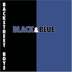
What You See Is What You Get: Backstreet Boys - Black and Blue


If there's any proof needed as to why prefab corporate pop music sucks, here it is in all of its drab and soulless splendor. I used to wonder why Mark Rothko's modern color faceoffs were always held in high regard in the art world. He's Michaelangelo compared to this boring, precise color presentation that's indicative of the rushed, cardboard standup product of its performers. I understand Rothko now and I appreciate the relationship of colors he was trying to convey, even when they grossly contrasted each other. At least that has more heart and mental input than this garbage. I wonder what hack got commissioned to do this cover. Buy him or her a beer; that's the greatest scam ever pulled.

Thank God the boy band era has seen fit to go back into the obscure hilarity from which Menudo and New Kids on the Block dwell like the pre-packaged paper dolls they were, sitting in some former little girl's attic, not to be unearthed for years. Thank God there's some things you can outgrow.

Now the real bitch I have about this album is that I've picked up it many times and always forget it's not the hard rock band Black 'n Blue, but I fall sucker for it a lot. If any of you see me bring it to the register, please have me committed on the spot.

Sunday, June 17, 2007

Deep Purple-In Rock


Photo Sharing and Video Hosting at Photobucket

Do you have to think a lot of yourselves to insert your image onto a monument? Maybe and perhaps even more so if you are a British band and you put your mugs on an American monument. Still I smile every time I see this cover. I find it funny and I do think that Deep Purple were saying they had confidence in themselves. Indeed the music contained here speaks volumes. Deep Purple covers were often hit and miss, but this was always a hit with me.


Thursday, June 14, 2007

Massive Attack - Mezzanine


It didn't take long for trip-hop to become hopelessly mired in yearning female singers and lite dance beats. The cover of this 1998 Massive Attack release, however, perfectly symbolizes the original sound of the genre: a juxtaposition of beauty and ugliness; calmness and anxiety; peace and violence; subtlety and aggression. The beetle on the cover is, well, icky... especially to those of us who don't like creepy crawlies. But like the music within, the image twists things around and confronts us with the horrific beauty of something we might otherwise overlook.

Labels:

Wednesday, June 13, 2007

The Clash - London Calling


When a band chooses to copy a classic album cover, it can be viewed in several ways: as a mockery, as a rip-off, as a tribute or as just plain arrogance. When the Clash chose to imitate Elvis Presley's first album for their make-or-break third release, I don't think they could be accused of mocking their predecessor and, considering the impact of London Calling, I don't think it can be viewed as a rip-off either. The Clash knew they had to do something special and instead of trying to play it safe, they went for broke with an ambitious double album that tore down the definitions of pop music just like Elvis had before them. Was it punk? Pop? Reggae? Rockabilly? Yes, it was all of those and more. This album shook the foundations of rock music. In that sense, the cover could certainly be seen as a tribute and an arrogant one at that. As amazing as their first two albums were, the Clash hadn't established themselves among the greats of rock n roll. By choosing to model their cover after Elvis', they were stating in plain view that they were making a truly great record, one of which the Elvis of 1956 could be proud.

Labels:

Tuesday, June 12, 2007

Warlock - Triumph and Agony


In honor of my interview with Doro Pesch the other night, I wanted to cue up this album cover, particularly since my t-shirt uses this image on the front with "Doro" scrawled across the top, with other artwork from this album on the back, which is the same evil spectre crushing Doro in his clutches.

It's all cheesy, but it's so deliciously reminiscent of 80s metal, the sword and sorcery ambience with Doro seeming to derive strength, not pleasure, from the creepy sorcerer who's inches away from getting a handful, so to speak. It's slightly erotic without crossing the line, but moreover, the detail is pretty good, as far as this genre of artwork goes.

Love it or hate it, it's glorious for its time and place. Stay hard! True as steel... Wait, that was the album before this one, but that album cover is nowhere near as fun.

Sunday, June 10, 2007

Black Sabbath-s/t


This was the band's debut from 1970. I remember staring at this and many other Sabbath covers right when I first got into them. If everything on the cover were more distinct then it would not have the same effect. I think that the style of the picture helps make the cover. Everything is a little hazy and a little unreal. You can't quite make out the woman's eyes and everything is a little dark. I think it leaves some things to the imagination and it works by implying a little, but not too much.

Friday, June 8, 2007

Ride - Nowhere


I doubt Ride could have picked a more appropriate cover than this. The wave looks both serene and powerful and Ride's wall of jangly guitar noise has much the same effect. Ride trusts the listener with this cover, because it could easily be passed over yet with just a little thought, it says everything there is to say.

If you're curious about the music, check out my review of this album.

Labels:

Thursday, June 7, 2007

Metallica - Metallica (aka Black Album) / Prince - The Black Album

There are two obvious follow-ups to last week's post on The Beatles: Prince's The Black Album and Metallica's eponymous black album.


As a political statement, Prince's album is compelling; as an example of design, however, it epitomizes the difference between "simple" and "boring." Like the music on The Black Album, the cover was a good idea that didn't quite come together.


Metallica succeeded where Prince failed. The cover is simple, it reveals layers of design that are not apparent at first glance, and its meaning is open to interpretation. Additionally, by alluding to the censored version of Spinal Tap's Smell the Glove album, it demonstrates a sense of humor and self-mockery that Metallica lost by the late '90s.

I thought the snake on the cover was a bit cheesy until I learned that it's taken from the Gadsden flag (i.e., the "Don't Tread on Me" flag). The snake was derived from a comment made by Benjamin Franklin that the colonists send rattlesnakes to England as thanks for the English criminals who were sent to America. One thing I always liked about Metallica is their willingness to make their listeners think.

Labels: ,

Wednesday, June 6, 2007

The Cars - Candy-O


I've been on a Cars kick the past week, so I'll choose this cover. We used to have a wonderful record palace in Baltimore called The Record Theatre, which was at its peak during the late seventies to the late eighties, and it was just huge for its time. I always relished the opportunity to go there, particularly when Candy-O came out, because the store had the album cover in a giant lit display that glorified the dripping sexuality of the cover, and if my parents were with me, I'd have to get crafty as I stared at it. Without them, I gawked like an absolute pervert, particularly at the erect nipple pushing through the tight fabric of the redhead splayed out on the car. I was fascinated with the fact that the artist chose to leave the car transparent with the girl represented in full. It represents the male fantasy aspect of fast cars and fast women with an emphasis on faster women in this case. The car is merely a subtle pedestal to display the beauty of the girl who seems to softly beckon you to her. Every so often I still get my loins stirred into an uproar by this cover. My wife thanks The Cars for that. Not.

Sunday, June 3, 2007

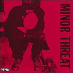
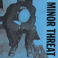
Minor Threat (s/t, Red, Complete Discography)

Photo Sharing and Video Hosting at Photobucket

This is a little different as it's really the same picture used for three different albums. In 1981 DC hardcore band Minor Threat released an eight song self-titled ep and it had a red cover. I believe it was at times refered to as simply "Red" by fans although that was never an official title. In 1984 this album was re-released with the four tracks from the previously released "In my eyes" single added on. I remember having this version on cassette and it was the same picture only in blue.
Photo Sharing and Video Hosting at Photobucket


Then in 1988 the "Complete discography" was released on CD. It included everything from 1984 album plus the "Out of step" album and the "Salad Days" single. It was once again the same picture in red.
I like the cover for it's simplicity yet it still stands out. I definitely prefer it in red though. The blue seems a bit too sedate yet the red seems more in your face which goes along with the music.

Friday, June 1, 2007

The Beatles - The Beatles (aka White Album)


To my knowledge, this was the first rock cover that dared to be this simple. By having the vision and courage to strip the cover down to nothing*, The Beatles established a standard that no one has surpassed (and very few have even tried). It's proof that sometimes the most compelling design is the simplest one.

The original pressing was a glossy white cover designed by British artist Richard Hamilton. The band's name was embossed (not printed) at a slight angle, and a unique number was embossed on each cover.** As happened with The Wall, subsequent editions had the words "The Beatles" printed in grey or black, a change that destroyed the integrity of the design.

* Part of this cover's beauty lies in the fact that it can be interpreted in so many ways. Since white is the inclusion of every color in the spectrum, I see this album cover as The Beatles' statement that they included every color of their musical spectrum in this recording. In that sense, the cover doesn't represent 'nothing;' it represents 'everything.'

** To me, giving each album a unique number recognizes the unique relationship that each fan has with an album. By doing this, The Beatles acknowledged the most important color of their musical spectrum: each and every one of their listeners.

Labels: