Monday, February 23, 2009

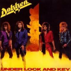
Dokken-Under lock and key
Photobucket

In 1984 Dokken's "Tooth and Nail" hit and achieved a fair amount of success. So the band were back in the studio and quickly knocked out a follow-up to try and catch in on their new found success. For this their third release they decided to stick themselves on the cover. The first thing that strikes me about this cover are the outfits. They just don't look ridiculous even by 1985 standards. Someone seemed to think it was very important for each member to have their own designated color like they are pieces in some tacky, hair metal board game. Next we have a large, vertical key shape smack dab in the middle of the cover. Then if you look closely you see that the key shape is actually shaped like the Dokken logo. Yet the Dokken logo is already in the upper left hand side in bright yellow for all to see. So did it need to be there again? I guess it was the idea of someone who really thought the band just needed a push no matter how silly it looked. Or perhaps it's there just to seperate George and Don so they would not strangle each other. The band are also standing in what appears to be urine colored smoke. After all this attention to the above images at the last minute someone probably slapped their head and said "doh, we forgot about the album title!". So it was quickly smacked in at the bottom in bold, but generic letters in bright red. The overall effect is one of pure cheese. I also get the impression that whoever did the cover was trying to sell the band as much as they were trying to sell the album and that approach doesn't sit well with me. However, once you get past the cover it's a decent album musically.

Labels: , ,

Sunday, February 15, 2009

Pink Floyd, A Momentary Lapse of Reason


Something about this cover impresses me.

It’s probably the great effort the designers put in to make it happen. Instead of relying on studio tricks and effects to get good cover art, they took 700 beds to a beach in Devon in England, setting the stage for an amazing picture.

Now that’s dedication.

I have not been able to discover, however, whether the hang glider above the scene--probably a reference to the "Learning To Fly" single on the album--was actually live in the shot. I hope so; it somehow seems a much better cover if it's real.

Sunday, February 8, 2009

Def Leppard - Hysteria singles


"Mutt" Lange, who was unfortunately the driving force behind Def Leppard, wanted to make Hysteria a hard rock version of Michael Jackson's Thriller. While the album is pure formula, its ability to connect with the superficial pop audience of the 80s was almost unparalleled...except by Thriller itself. The band even bludgeoned the listening public with the same number of singles (seven). As unfortunate as it was that an album based more on market research than rock n roll shot up the charts like it did, at least they had an interesting concept for the artwork: the singles would fit together to reproduce the Hysteria album cover. The problem was that there is no way to make a square out of seven smaller squares (I guess they didn't do very well in Geometry) and therefore the seven singles don't fully deliver on the promise of their concept. Of course, Hysteria didn't fully deliver on the promise of Pyromania either, so I guess it was quite fitting after all.

Wednesday, February 4, 2009

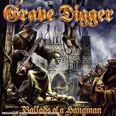
Grave Digger - Ballads of a Hangman


Still going strong are the German power metallers Grave Digger. Ballads of a Hangman is due out shortly, but the album cover really caught my eye before the promo hit my mailbox.

Outside of the cheesiness factor of the Grim Reaper holding a guitar as part of his role as inquisitor and executioner against a monestary of monks, the details of this piece are pretty impressive if not blasphemous.

Labels: