Sunday, August 26, 2007
Contributors
Contact Mark
Contact Ray
Contact Chuck
Previous Posts
- White Lion - Big Game
- Bad Brains - s/t
- KMFDM - Angst
- Priestess-Hello, Master
- Hammer Head-Rock Forever
- Massive Attack v. Mad Professor - No Protection
- Megadeth - Countdown to Extinction
- The Black Crowes - Amorica
- M-16- Locked and loaded
- Warrant - Cherry Pie
Subscribe to
Comments [Atom]


4 Comments:
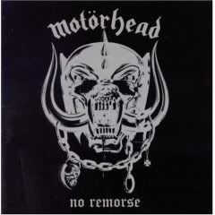
It's come back in other forms over the years, but I like it here at its simplest.
You can never go wrong with Motorhead covers. There isn't a bad one in the bunch except for "Overnight Sensation".
bob-I agree.
dschalek-March or die wasn't too spectacular, but most of them are really good.
Yeah, the Deaf Forever beast has had almost as many appearances as Eddie!
Post a Comment
Subscribe to Post Comments [Atom]
<< Home